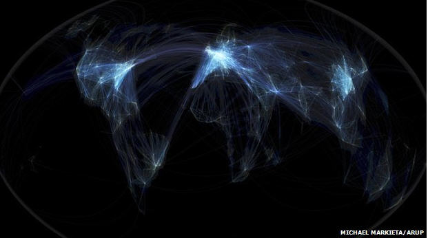
Five experts in different fields (including art, philosophy, and the environment) look at the rendering of all the world’s airline routes and say what they see. Fascinating.
From The Data Visualiation ExpertDamien McCloud
Visualizations like this are great. This is very clean and very simple and it gives an instant narrative. But my concern is that there’s a tendency to over-interpret these kinds of pictures. You can see the density of the flights, but it doesn’t show you how many people are travelling on them.
From Mark Vernon, The Philosopher
We are not seeing the life of individual human beings, but the life of the species as a whole, as if the species was one organism, pulsating like a jellyfish. Maybe it represents our collective existence?
Because of the darkness, it’s like a side of ourselves that no individual can control or understand. It feels like a dream – the collective unconscious perhaps.
From John Strickland, JLS Consulting The Aviation Consultant
Europe looks so bright because it has so many short-haul flights. It’s also one of the busiest global markets and there are several hubs in relatively close proximity in Europe: Paris, Frankfurt, Amsterdam and London.
You can very clearly make out American hubs like Atlanta, Dallas, Houston and Denver – there’s a saying in the US that whether you go to heaven or hell, you have to go via Atlanta.
From Estelle Lovatt, The Art Critic
It is not only dealing with two-dimensionality, it’s trying to create three dimensions, or four dimensions – giving you a notion that you are travelling across the surface of this image.
It’s almost like contemporary fractalisation – based on fractals, those beautiful divisions of science and nature. A number of artists have exploited them. Max Ernst based a lot of his surreal landscapes on fractalisation.
From Bill Hemmings, The Environmentalist
When you see the three brightest patches – Europe, North America, and East Asia – you are seeing the three main focuses of aviation emissions. I am surprised that the Transatlantic flights do not show up as brighter because emissions are intense there as well.
The images re-affirm what we already know. Between 1974 and 2009, cumulatively, Europe was responsible for 38% of aviation traffic, Asia/Pacific was responsible for 29%, and North America for 20%.
that the Transatlantic flights do not show up as brighter because emissions are intense there as well.
The images re-affirm what we already know. Between 1974 and 2009, cumulatively, Europe was responsible for 38% of aviation traffic, Asia/Pacific was responsible for 29%, and North America for 20%.
The above excerpt and summary was taken from the BBC and the full article is here.
Photo credit: Michael Markieta/ARUP.

Ewan Spence is a blogger, author and writer based out of Edinburgh, Scotland. In addition to his own blog, he has contributed and contributes to BBC News, BBC Magazine (online), The Stage (UK Arts and Entertainment Newspaper), Computing (VNU), iProng Magazine, IT Pro, O’Reilly’s Make Magazine, Palmtop Magazine, Podcast User Magazine, UK Tech and UK Mobile Blognation, PDA Essentials, Mobile Messaging 2.0 and All About Symbian.
He wrote the book Rapid Mobile Enterprise Development for Symbian OS and has audio program commissions for BBC Radio 5 Live – Through the Night and Pods and Blogs, Computer Outlook Talk Radio Show and Talk 107. He also regularly speaks at and moderates panels at high profile technology conferences around the world.


