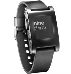
Four weeks on the wrist, and I’m all set to go Charlton Heston on you if you try to pry it off. The Pebble smartwatch cracks the challenge of the smartwatch, and while it’s not the final iteration of the wearable technology, the Pebble reminds me of the promise of the early Psion and Palm devices I used.
The Pebble reminds me of the early days of the PDA, with many limitations in the hardware and software being overcome by smart hacking. The limitations of size and interface are obvious, while others are down to the hardware design (the Pebble watch currently has space for just eight third party apps, be they watch faces or apps accessed from the Pebble menu). But the small Pebble team are doing their best to harness the community, get them involved, and improve the product through their efforts. That’s paying off.
Should you buy the Pebble? If you’re in the market for a smartwatch, it certainly has to be one of the watches to consider. Of the current watches on the market, it is the one that I would buy for myself.
As for recommending it, anyone looking at the Pebble has to remember that it is on the cutting edge of wearable technology, and it’s not going to be perfect. But it’s the smartwatch that I feel has the most promise, will have the most development and support, and will never be a chore to charge and wear.
Because the Pebble watch makes a number of different design decisions to the big boys which all have a positive impact on the watch, and none more so than the screen. It’s one of the smaller screens on a smartwatch, at just 144×168 pixels. It’s also monochrome.
Strictly speaking it’s a transreflective LCD screen with a backlight, and while many people have labelled it as an e-ink screen (similar to eBook readers such as the Amazon Kindle) it’s important to stress that Pebble is marketing the screen as e-paper, not e-ink. It does not suffer the slow response rates or shadowing that you see on eBook readers, and will happily run at 30 fps with no blurring if an application demands it.
The Pebble also forgoes a touchscreen, instead relying on four buttons around the edges of the watch. On the left of the screen is the ‘back’ button, while the right side has three buttons, a cursor up, cursor down, and a forward/choose button. These all require a positive action press, and I doubt you’ll trigger any of them by accident.
The USB cable is only for charging, all your communication with the Pebble watch will be over the Bluetooth connection on your smartphone. The Pebble supports Android and iOS devices with Bluetooth 2.1, and can also support the low energy Bluetooth 4.0 profile. The core Pebble app is available in both the Apple iTunes App Store and in Google Play, and will allow you to update the firmware on the watch, as well as provide the ability install watch faces, apps, and send notifications from your smartphone’s applications to the Pebble screen.
More in-depth thoughts on Pebble over on Forbes.
Photo credit: Get Pebble.

Ewan Spence is a blogger, author and writer based out of Edinburgh, Scotland. In addition to his own blog, he has contributed and contributes to BBC News, BBC Magazine (online), The Stage (UK Arts and Entertainment Newspaper), Computing (VNU), iProng Magazine, IT Pro, O’Reilly’s Make Magazine, Palmtop Magazine, Podcast User Magazine, UK Tech and UK Mobile Blognation, PDA Essentials, Mobile Messaging 2.0 and All About Symbian.
He wrote the book Rapid Mobile Enterprise Development for Symbian OS and has audio program commissions for BBC Radio 5 Live – Through the Night and Pods and Blogs, Computer Outlook Talk Radio Show and Talk 107. He also regularly speaks at and moderates panels at high profile technology conferences around the world.


