You’ve probably all used some kind of online invite service before, whether it be to have friends over for a simple, small gathering at your home or for a larger anniversary or birthday event. Let’s be honest, not all online invites are the same. I find that just as many traditional paper cards can be “kitsh” and tacky in their sayings or design choices, so can digital cards. If you want something more elegant and high end, you’ll find that it costs more and sometimes that cost can be significant depending on how upscale you want to go.
Paper cards with a bit more of an elegant twist include Minted, Red Stamp, and Greenvelope although we’ve yet to test them out. Apparently Greenvelope does digital invitations as well though more known in my northern California and New York circles, is Paperless Post. It could be because the company is based in New York and has been around now since 2009, certainly not the oldest in the space by far, but they’ve been creating momentum nevertheless.
While Paperless Post helps you create both online and paper stationery that reflects an individual aesthetic, I feel that they’re more known in the online space. They offer a number of distinctive and customizable designs so you can create whatever look you’re after — vintage, elegant, sophisticated, feminine, cocktail-chic, modern, retro or fun. Whether it’s for a baby shower or a milestone life event, they have a boat loada designs to choose from.
What I didn’t realize when I originally went into the process was that Paperless Post collaborates with leading fashion and lifestyle designers, including Kate Spade, Oscar de la Renta, Jonathan Adler, and John Derian. If you haven’t yet heard of them, I’d be surprised, but my guess is that while some of you may have received one, you may not yet have tried them out for one of your own invites. Apparently Paperless Post users have sent over 85 million cards which is a significant number.
Leading up to my birthday towards the end of 2015, I decided to make that number 85 million and 200. I’m in the social world, both online where I’m prolific on social media and in the real world where I have acted as a Publicist for innovative technology and lifestyle products and services over the years. I’ve “worked” events, created events, customized events, hosted and co-hosted events of every size, from 6 to 1,000 and everything in between. In other words, throwing events isn’t new to me.
My girlfriend Michele decided to host my birthday at her house since it had easier parking than my pad in San Francisco and there was more space overall including a backyard with a patio, fire pit and inside fireplace. Truth be told, I’ve received Paperless Post invites for several years but never used them for one of my own bashes, so we decided to put them to the test for my birthday party where I hoped to have anywhere between 50 and 100 attendees. Any party thrower knows that you need to ramp up the number significantly to get the optimal number you’re after and even those who do RSVP may be no-shows in the end, even the most reliable of friends. This is no truer in California than any other place I have lived and thrown events.
I wanted this invite to mix elegant with fun. The age range of the attendees were 30-60 with most being in their forties. I invited musically inclined friends, encouraging them to bring instruments, so the invitation needed to also appeal to the artistic and creative on my invitation list, while feeling cosy and elegant enough for my more traditional friends who might come for an hour or two but not sing and dance with us till 2 am.
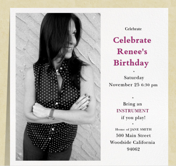
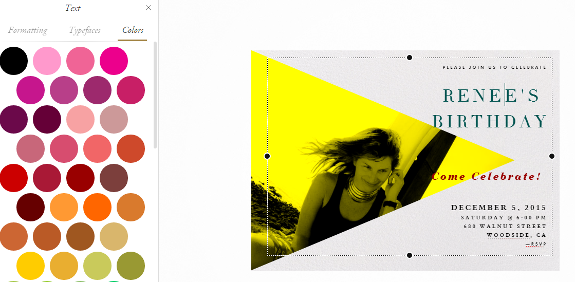
The below design is the direction I landed with although I went through several variations of this design before deciding on the final look and feel.
Getting Started
Here’s how it works. You start with selecting the card design template itself and from a wide array of palettes, you can choose the texture and color of the background, both for the card and the area surrounding the card. Some of the backgrounds are free and others cost you a “coin” or more depending on the style you choose. You can purchase “coins” online once you sign up for an account and use those to create your invitation design as well as your envelope design – yes, there are options there as well. You can also choose your own font style and size and vary it throughout the text on the front of the card as I did above.
In the above design, I went with a classic and elegant color palette to appeal to the more conventional attendees whereas I tossed in some bright pink to add a little spice to the invitation itself. My choice of photo was one way of adding “fun” to the layout. You can choose to upload a photo of your choice, or go with one of their options or templates to give you whatever look and feel you’re after. The text of course is up to you and matches the logistics in the back end which is available to your guests after they RSVP or decline. The details once they go to the event page includes things like notes (dress code, directions, where to park, what to bring, kid friendly or not), the address and phone number, start time and so on.
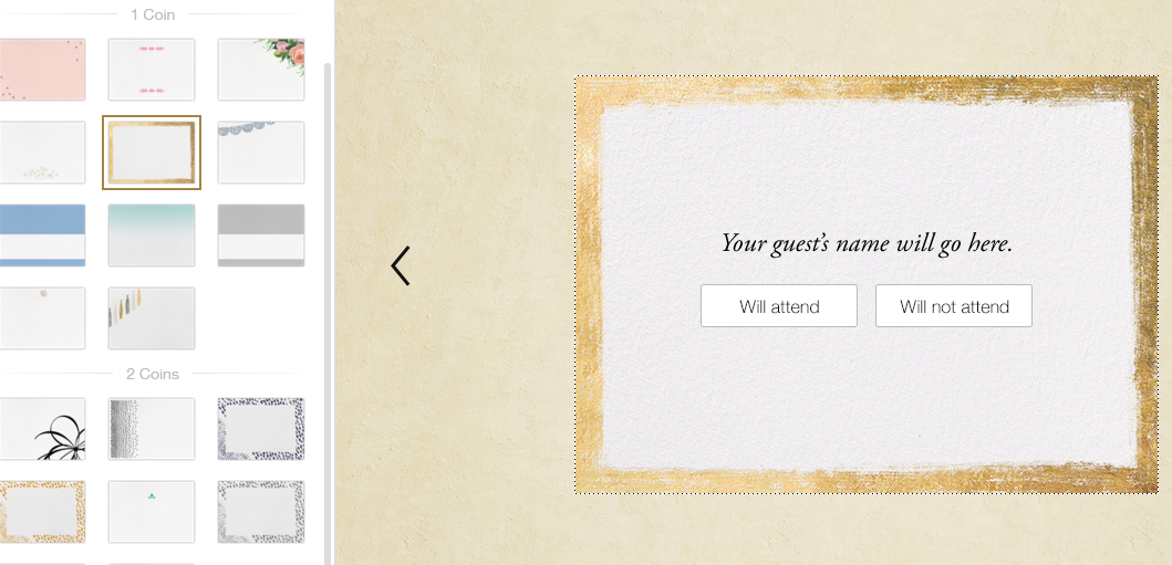
Below are a few random choices in their design tools you can choose from for the RSVP card — the type of design you select obviously impacts the price. Note the one I selected below costs 1 coin.
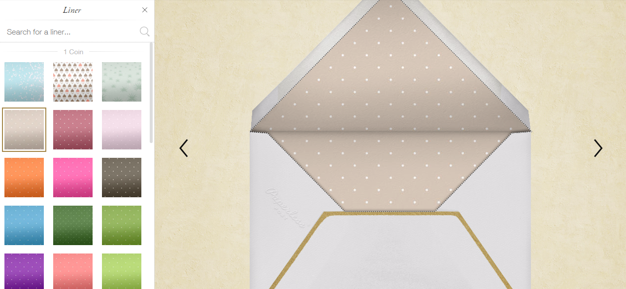
Here, you can choose texture or a solid color for the inside of your envelope and note that the one I selected below also costs one coin. Bear in mind that this is one coin per guest on your list, so the total by the time you complete your card could be 1, 2, 3, 4 or more coins per recipient. If your overall invitation design ends up being 5 coins per recipient and you have 100 recipients on the list, then your overall cost would be $50.
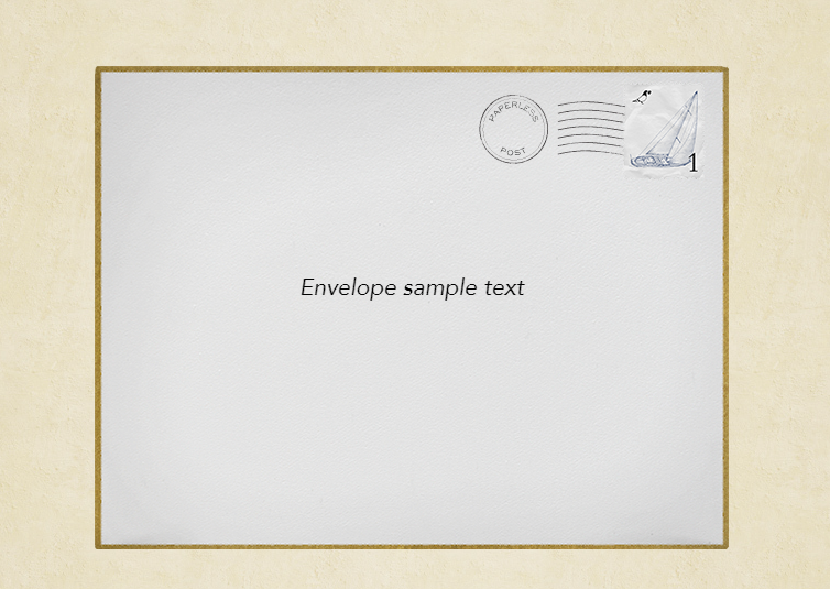
Below is the front of the envelope – note that I decided to add a classy touch by selecting a gold trim to the border.
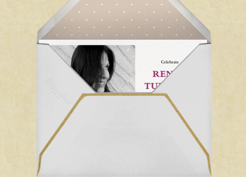
When the recipient receives the invitation via email, the visual image looks like this, that is if you choose an envelope when you go through the process. You can keep the cost down by not choosing an envelope at all and choosing more basic designs. In the case of my final creation, the invitation below rises out of the envelope, the envelope slides off to the left and the full visual of the card is then presented to the receiver.
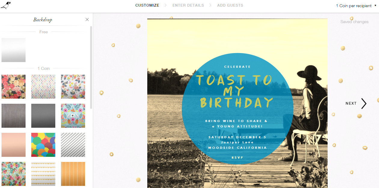
Below is another design option I was playing with earlier in the process, a simpler card I was thinking of without an envelope. Note that in the “Backdrop” design tool section, you can select a free background which is a simple white or a textured background. In the case below, the background with golden yellow dots costs 1 coin per recipient.
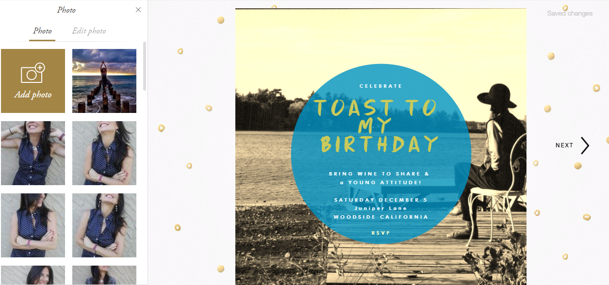
This card template had an option to upload a photo into the background of the card whereas your invitation details was dedicated to the circle in the middle of the card. Note that they had a few different options for the circle’s color and the variation of the color was fixed – in other words, you couldn’t make it less or more transparent. Font style and color was flexible of course, just as it was with my final card design.
Overall, we loved the process and had fun creating and sending. In the end, I sent out a couple hundred invites since I wanted to include closer friends from the East Coast as well even though I knew that 95% of them wouldn’t be able to make it out for my party. That said, while I wanted to make them feel included in this life event, it was a hard decision since I knew that each recipient cost a certain number of coins (4 coins in my case) so bear that in mind when curating your list.
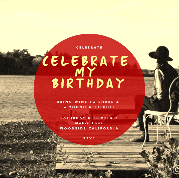
For example, another template I was playing around with (pictured below) was only one coin per recipient at this point in the design process minus any envelope or RSVP card design options, where you can keep simple or go more elaborate depending on the image you want to convey. I’m a fan of great design mixed with creativity so wanted to add a few fine details, but what’s great about the design tools and customized process is that you can choose what you want to include and leave out depending on your taste, the kind of event and your budget.
One last thing to note which is a nice feature: Paperless Post keeps drafts in your account so you can revisit and modify them later on for a future event. Once you import your list into their system, it also saves that list in your account, which you can customize, i.e., Renee’s Birthday 2015, Christmas Party 2014 and so on. I received a Paperless Post invitation from my friend Jack for his holiday bash and it is saved in my history as well. More information and to get started is at www.paperlesspost.com. and invitations on Paperless Post .

Renee Blodgett is the founder of We Blog the World. The site combines the magic of an online culture and travel magazine with a global blog network and has contributors from every continent in the world. Having lived in 10 countries and explored over 90, she is an avid traveler, and a lover, observer and participant in cultural diversity. She is also the founder of the Magdalene Collection, a jewelry line dedicated to women’s unsung voices and stories, and the award-winning author of the bestselling book Magdalene’s Journey
She is founder of Blue Soul Media and co-founder of Blue Soul Earth as well as the producer and host of the award-winning Blue Soul CHATS podcast, that bridges science, technology and spirituality. Renee also founded Magic Sauce Media, a new media services consultancy focused on viral marketing, social media, branding, events and PR. For over 20 years, she has helped companies from 12 countries get traction in the market. Known for her global and organic approach to product and corporate launches, Renee practices what she pitches and as an active user of social media, she helps clients navigate digital waters from around the world. Renee has been blogging for over 16 years and regularly writes on her personal blog Down the Avenue, Huffington Post, BlogHer, We Blog the World and other sites. She was ranked #12 Social Media Influencer by Forbes Magazine and is listed as a new media influencer and game changer on various sites and books on the new media revolution. In 2013, she was listed as the 6th most influential woman in social media by Forbes Magazine on a Top 20 List.
Her passion for art, storytelling and photography led to the launch of Magic Sauce Photography, which is a visual extension of her writing, the result of which has led to producing six photo books: Galapagos Islands, London, South Africa, Rome, Urbanization and Ecuador.
Renee is also the co-founder of Traveling Geeks, an initiative that brings entrepreneurs, thought leaders, bloggers, creators, curators and influencers to other countries to share and learn from peers, governments, corporations, and the general public in order to educate, share, evaluate, and promote innovative technologies.

